
The ten Usability Heuristics by Jakob Nielson for user interface design (UI) are some of the wildly used Heuristics utalised in this field. They are referred to as Heuristics as opposed to anything else as they are more basic guidelines than direct rules of thumb when creating a user interface.
1. Visibility of system status
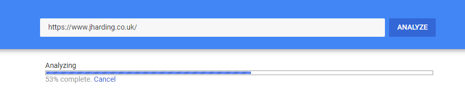
Thu user should always be aware of what the system is doing at any time.
2. Match between system and real word
As much as possible the system should match as much as possible the real world.
E.G. You will find a book on Amazon in the same category as the section you would find it in store.

3. User control and freedom
Users often end up in certain areas by mistake. There should also be a route for the user to exit these areas. Ideally you should support ‘undo’ and ‘redo’.
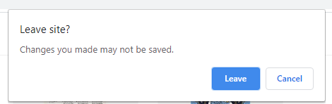
4. Error prevention
Better than good error messaging is error prevention in the design. Secondary warning message’s such as ‘Are you sure you want to leave without saving’ are good practice.
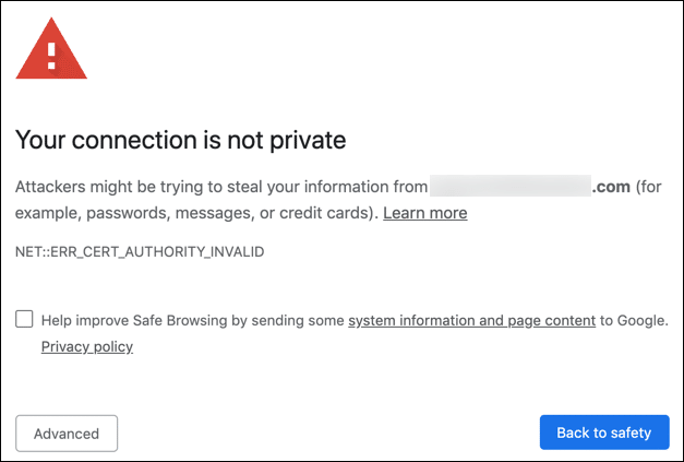
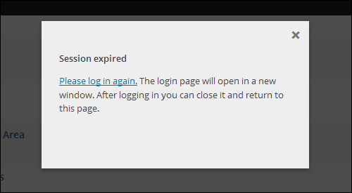
5. Help users recognize, diagnose and recover from errors
Error messages and ways of recovering from them should be written in plain language so that the user knows how to recover from them.
6. Consistency and Standards
The user should never have to think what the terminology means. Clear text should be used, and as much as possible should remain consistent across the product, both in terminology and layout.

7.Recognition rather than recall
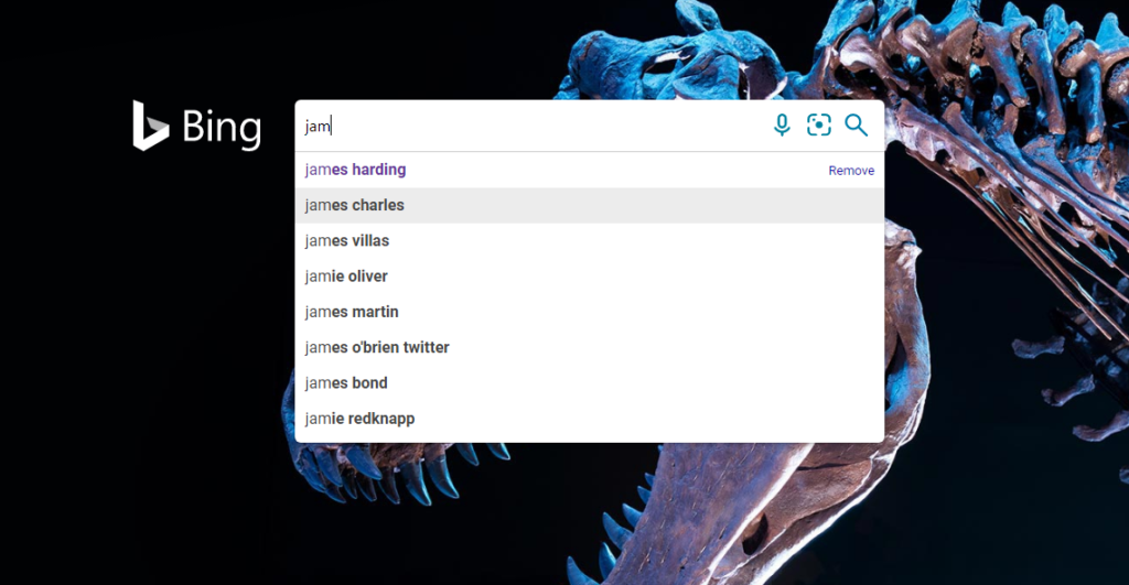
The user should never have to recall from a previous page or communication. The system should detect and present options from the users previous actions.
8. Flexibility and efficiency of use
Allow users to tailor their frequent activities. Make the system adjustable, without notice, for both inexperienced and experienced users.

9. Aesthetic and minimalist design
The design should be aesthetically pleasing and minimalist. Avoid unnecessary clutter and confusion.
10. Help and documentation
How to get help should be easily evident and available to the user in a variety of formats. These would typically include self help documentation/videos as well as a means of getting in touch with the product owner.

I hope you enjoyed this post on the Ten Usability Heuristics. If you have any questions or comments, please use the form below.
Read more product related posts.